my roles
design leadership / workshop facilitation / competitor analysis / prototyping / usability testing / visual design

Mercury’s current online join experience was performing well but was also experiencing higher than intended abandonment rates – with many customers entering the first few phases of the journey but “dropping-off” before completion.
This partnered with up to 50% of our customer’s a month churning to our competitors when moving house, creating a unique set of opportunities for Mercury to make positive improvements to both acquisition & retention rates.
We set out to identify the reasons behind these trends and to help design a new experience to improve both our business results and the lives of our customers, during their important life decisions.
opportunity
How might we improve our online Join & Move experiences for our customers to improve our acquisition & churn
Discovery
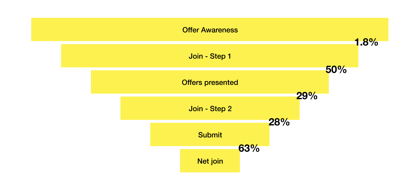
We began to unpack this problem by collecting as much existing data as we could. This enabled us to see at exactly what points of the “funnel” customers were being lost in the join journey and helped us to identify the highest value parts to focus on.
We also compared our journeys with our competitors, which offered up some interesting insights for how we may be able to simplify, improve and make things easier for our users.
…we were still left wondering…what are the biggest pain points for our customers when joining or moving with us online?
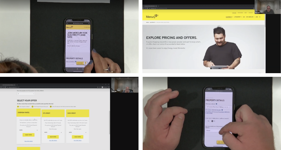
To tackle this wider question, we embarked on a comprehensive, in-person usability study to help us observe and talk in person with users with our partner The Space In Between.
learnings
Our discovery & research phase generated many valuable insights that we were then able to prioritise the highest value problems to solve with our stakeholders from across Mercury, including development and front-line staff.
At a high-level, we learned…
Users found it difficult to compare our product offerings across different plans – particularly rates & benefits
Users expected more information upfront, frustrated by having to enter so much of their information before shown what Mercury could offer them
Many customers were unable to find our move form – with no clear existing journey from our website to My Account
Users were likely to begin the process and pause to do their research, losing their path in the journey with no way to continue where they left off
With these improvements in mind, we began iterating on a experience – to not only simply the journey but give customers more of the information they needed to assist their decision making.
design & prototype
So what how did we use design to solve these problems?
Combine Join & Move journeys
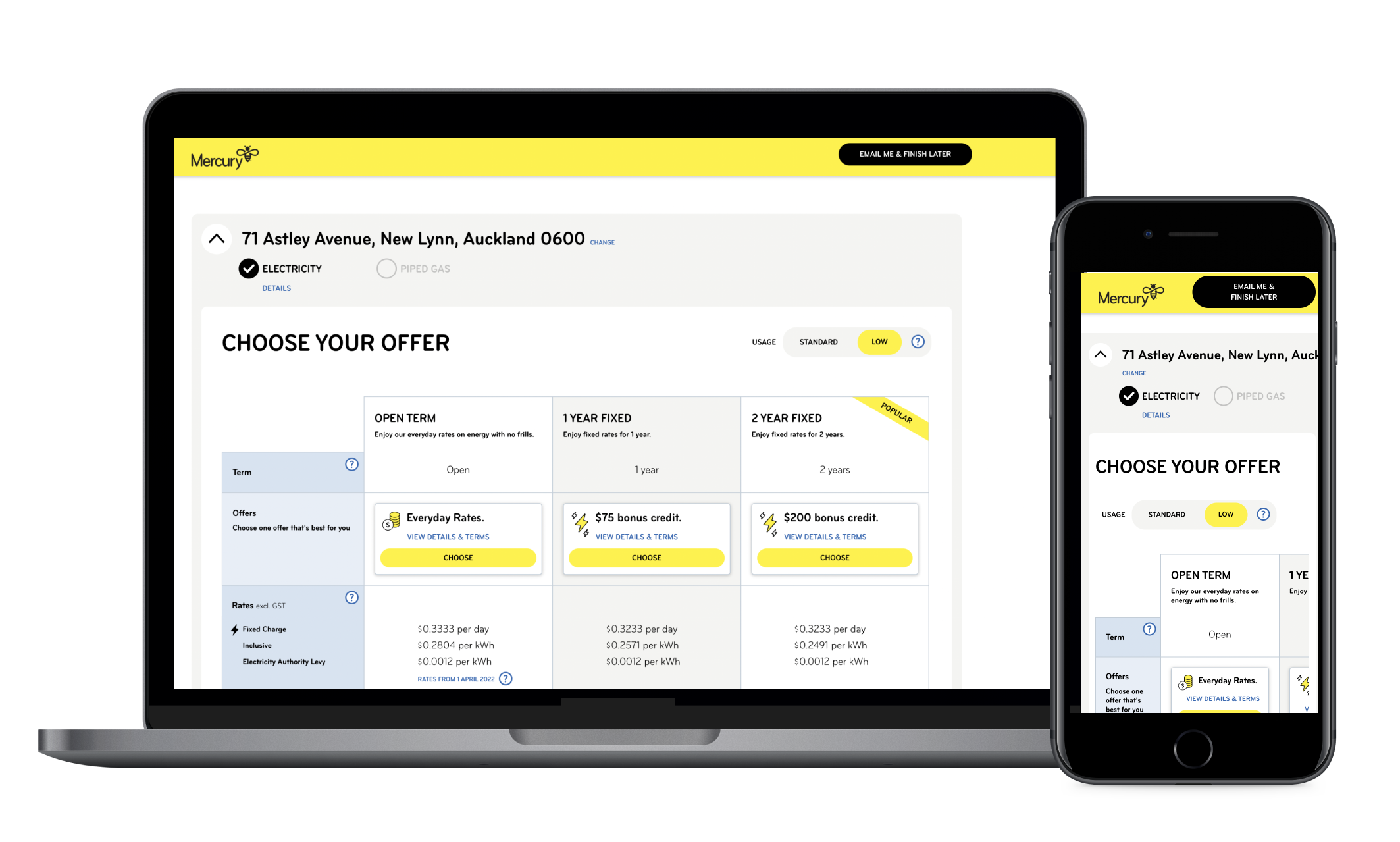
Rather than two distinct journeys, we designed a new combined journey helping guide our customers into one entry point that adapted based on their situation – are you moving house & are they an existing customer?Comparison table
Customers told us that our plans & offers were confusing and difficult to compare. We worked to simplify our offerings into 3 clear, concise propositions – good, better and best.From a presentation / UI perspective we iterated with customers to design a new way to help compare our offerings across what was most important to them
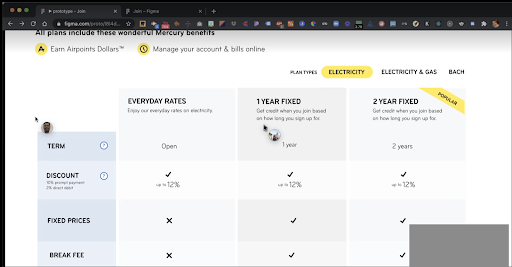
The final design was a clear, concise comparison table making it easier for customers to decide if Mercury was right for them.
Save & complete later
We learnt that many customers were leaving the page to do more research before committing, which causing frustration when they returned and had to re-enter information.To help users return quickly and retain their progress, we implemented a new feature to “Save & Complete later” – enabling them to jump back in at the same spot of the journey at up to 2 weeks from when they began.
Simplify & explain
To further help customers, we simplified the information you presented & requested – only gathering what were absolutely crucial.
We also added tooltips with clear explanations to parts of the places in the journey & terms we identified that customers may need extra support to help them decide.
results
Once we launched the new experience, the results really began to speak for themselves – showing impressive results for both Mercury and our customers.
Customers were joining & moving with us faster -
28% reduction in average time to complete (12m 29s vs 8m 56s)Customers were less frustrated - 27% reduction in “rage clicks”
More customers are completing their journey
14% increase in acquisition / conversionMore customers were choosing to stay long term with us vs open term
15% increase of customer’s choosing Fixed Term vs. Open Term = increase in HVC (High Value Customers)55% of all gains/moves taking a contract
70% of them choosing to fix for 2 years
More customers were returning to complete their journey later
18% conversion via Save & Complete later feature
To foster continuous improvement, we are now constantly monitoring feedback contributing to our backlog and roadmap.
*All numbers shown are weekly averages