
my roles
design leadership / journey mapping + empathy mapping / prototyping / usability testing / visual design
In August 2018, Auckland was hit by one of the most ferocious storms in decades.
The intense westerly high winds that enveloped Auckland caused chaos across the region, with hundreds of thousands of customers almost instantly losing the Electricity supply to their homes.
Unable to cope with demand, the Vector Outage app buckled under the pressure - leaving customers without a vital means of communication to report their power or get updates about restoration.
When the dust settled a few weeks later, it was obvious that the Outage app - in its current state - was not fit for purpose for extreme situations.
This, coupled with a data breach a soon after, caused the Outage app to be rapidly retired, leaving customers with phone calls as their only option for reporting and checking on outages.
opportunity
“Design a new outage app experience that helps users during outages in both day to day and in the extreme circumstances”
The benefits for return to a Digital solution were two fold:
1. Giving customer’s direct access to information about their power outages
2. Reduction in costs to the by reducing calls to the Vector call centre.
An example persona - we had 8 in total
Discovery
I wanted to get back to basics and test all current thinking to reset the current outages experience & app.
After the April storm, it was apparent just how important the Outage app was to Auckland residents.
However, the app was only the front-end for a complex series of internal processes - which would also need to be addressed in order to successfully help customers in their times of need.
To begin, I started with building empathy personally and internally for the experiences of our customers.
I analysed over 2000 individual pieces of feedback received stored in Qualtrics. Feedback was sorted into groups using common terms, to identify themes to set an initial focus.
This user data also helped me to create a set of customer personas which were used to bring the stories and needs of our users to life.
Next, I collaborated with the Data & Analytics team to create a survey to send to over ~900 Auckland residents.
As a team of three, we talked with 12 customers during interviews in their homes, to gather even more insight and empathy into their journeys.
All of this insight helped shaped vital current state experience journey maps which, would be referred to throughout the design phase.
Collaboration
As outages involve many people across various roles at Vector, a co-design workshop was run to bring our people together.
Key people from across Vector were invited to discuss research to date and contribute to a master customer journey - helping them to identify pain points and potential pain relievers.
This workshop was fundamental in building empathy for our users while helping build momentum for future improvements to the way we worked, our processes and the new front end solution for our customers.
I also championed the use of Customer Effort Score (CES) to measure the success of the new experience. Although NPS is more widely used, it was considered inadequate for Vector they are the sole electricity distributor in the Auckland market with no direct competitors.
Master customer journey + empathy mapping
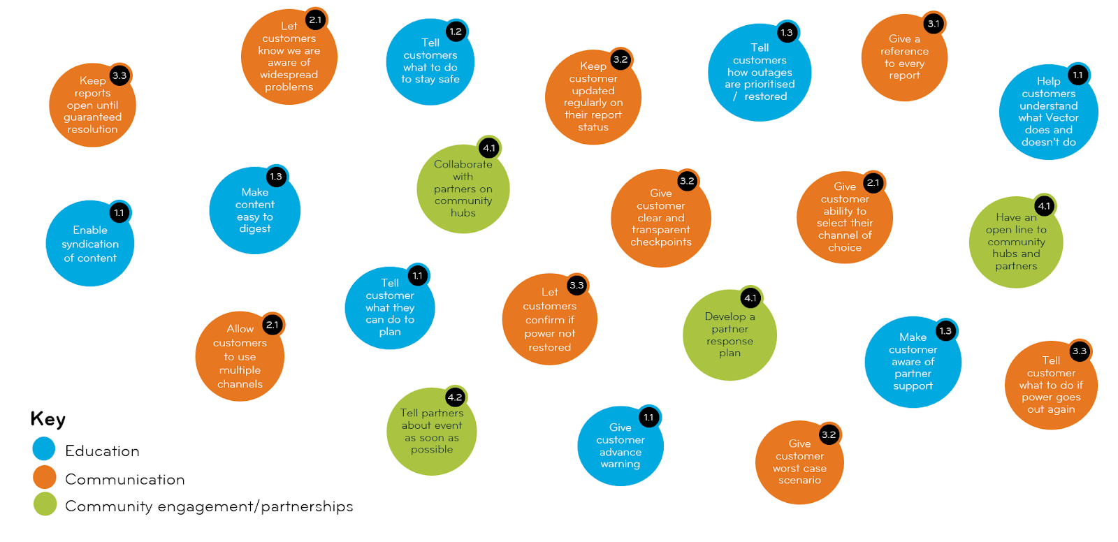
Guiding principles sourced from user research
From here, a squad was assembled consisting of representatives of various parts of Vector (Networks, External Comms, IT, Customer Service Desk) to work together and priortise user needs & features.
“Wait....no map?”
It was decided early on that any new solution would not initially include a map - in order to get a product into the hands of users as an Minimum Viable Product (MVP) to lean from.
The challenge was put to me, as the Lead Designer, to create a journey that did not include a map while still delivering enough value to our customers.
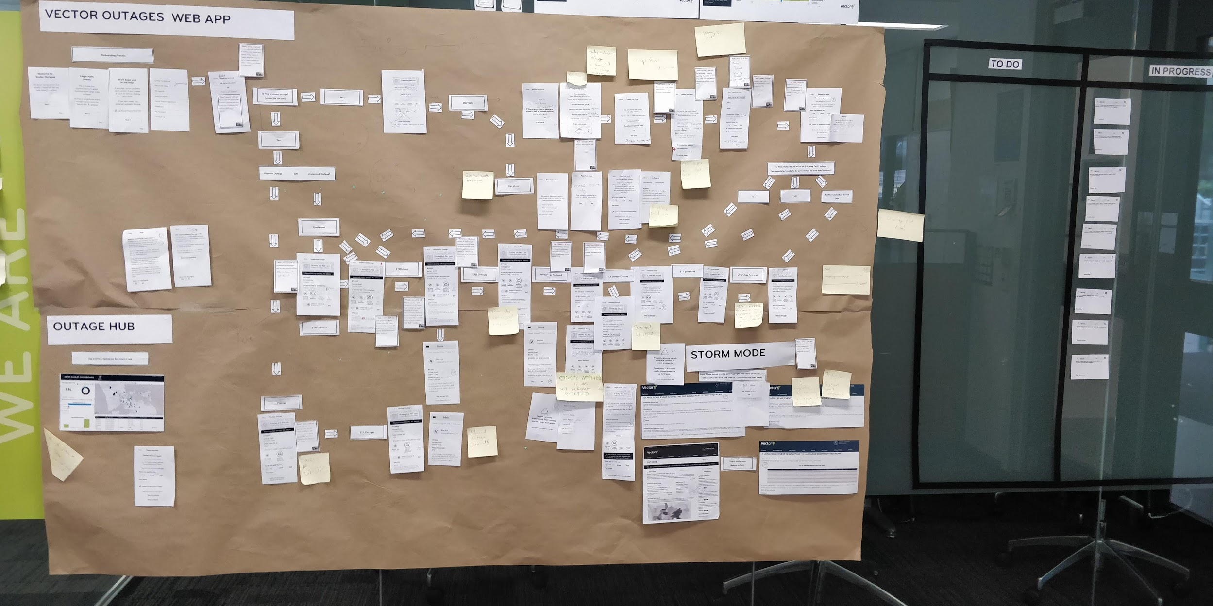

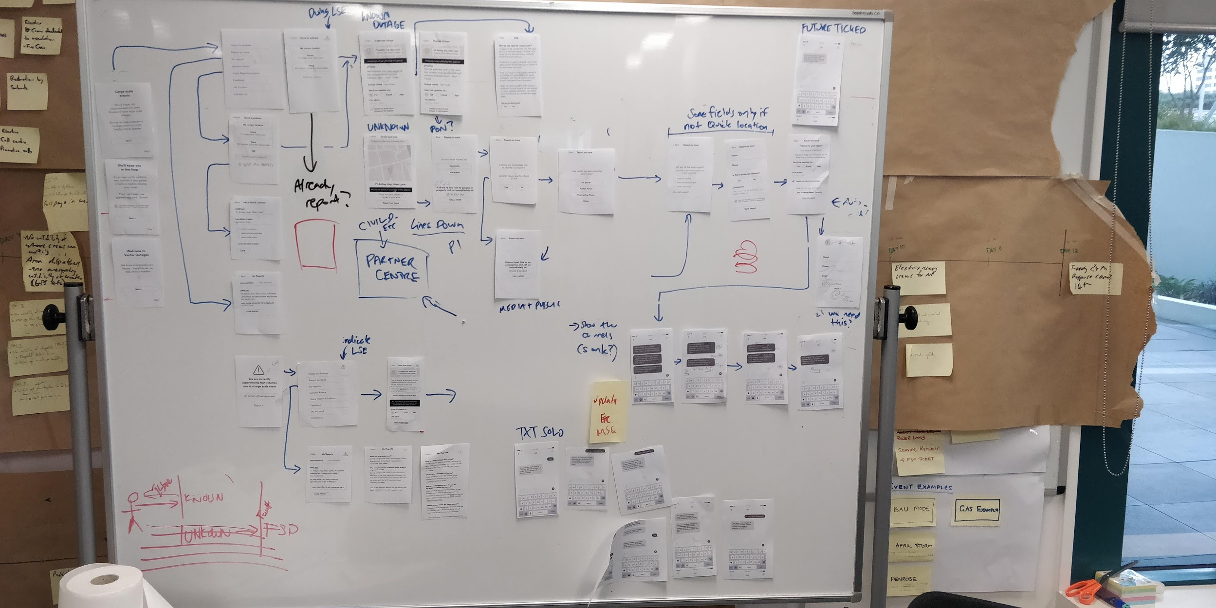
Solution design began as sketching out potential screens and user flows. Once we felt we understood the direction with enough clarity, we moved to creating digital wireframes & user flow diagrams.
I kept all work visible by posting new versions daily to a common area. I found this an important technique as it allowed anyone interested to offer feedback, regardless if they were part of the core team or not.
Throughout this phase, I stayed diligent at constantly engaging Stakeholders, Solution Architects and Developers, helping to give them all a voice in the designs of the solution.
Working together, we iterated with the group over many weeks until we arrived a solution supported by the business and that meet our needs identified in the research phase.
In parallel, I also worked closely with a BA to map out and plan any changes to business & people process needed to support the design.
User testing
The first round of user testing were black and white printed wireframes. As there were already available, it meant we could quickly begin to learn.
Before testing, I wrote the necessary test plan outlining any assumptions that needed validating, testing goals & expected outcomes.
The results of these tests formed the basis for the next iteration of design where I fine tuned screens / user flows and worked with Vector’s External Communications team to tweak copy into more customer friendly language.
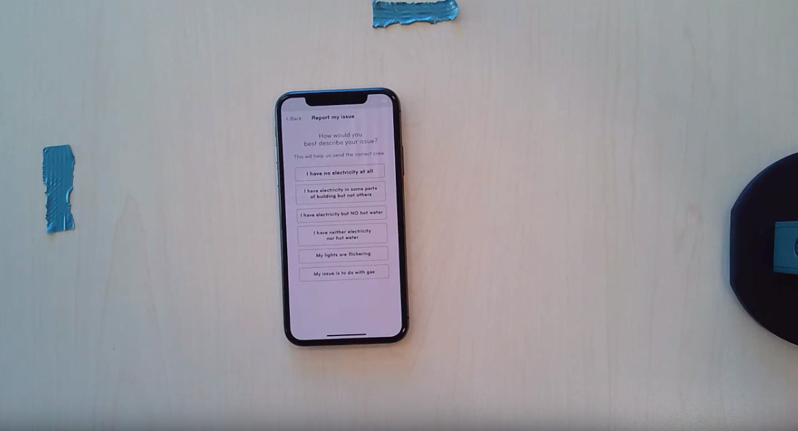
I then prepared testing of a low-fi prototype, keeping the prototype plain at this stage helped users concentrate on the feature and flow of the app rather than any finished, branded design.
The results from these sessions were then used to iterate into high definition screen designs, which I used to create a high-definition prototype.
My next round of testing focused on this high-definition prototype on mobile & desktop - attempting to give users an experience close to the finished product.
Once lessons & results from these tests were socialised with stakeholders and factored into the next iteration of the design, we were given the “green light” to begin into development as MVP and continuing iteration.
LESSONS
User feedback was generally positive. One major sticking point with users was the need to login in order to report an outage.
In light of Vector’s previous privacy breach a year earlier, login was set as non-negotiable so became a constraint I was challenged to design the experience around.
To unpack this problem further, I worked with internal stakeholders - including Vector’s Security Team - to explore options of how to make the process as easy as possible for customers, while still meeting their requirements.
Based on this research, final improvements to the experience were agreed with stakeholders and factored into the design.
Build
As a team, we were then challenged with building Outage Centre and having live in just over 3 months. This would ensure a launch before Xmas, important to Vector as this period of the year usually involved extreme weather that leads to a peak in customer outages.
Embedded directly in an Agile value stream, we collaborated to create Epics, User Stories and acceptance criteriain Jira which were prioritised and organised into sprints.
As a team, we worked as hard as we would to bring the product to life - eventually launching in Early Jan 2019.
FINAL THOUGHTS
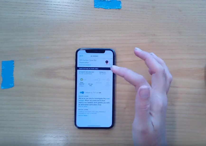
After launch, the new outage app was well received by customers who were thankful to have another option to check and report outages beyond just phone calls, giving them access to direct updates via text & email.
This was reflected in quantitive feedback (customer effort score) and qualitative feedback.
After launch, we also identified a direct relationship between app use and the reduction of calls to our call centre resulting in a direct reduction to cost to serve day to day.
We are gathering constant feedback from customers and I continue to iterate and improve based on direct feedback and initiatives from the business stakeholders.
As a team, we regularly review the CES score of outage centre and I am personally read customer comments which I collate in Trello. Using this board, I look for trends and insight to contribute to the product backlog and priortise improvements based on user needs & business impact.
Currently, we are in the process of re-introducing a map and further simplifying the sign up process as these are the two major pain points for our users.
Better never stops :)